Double Top Chart Pattern: How to Identify and Trade It Well

Double top chart pattern: how to identify and trade it well
What is a double top chart pattern?
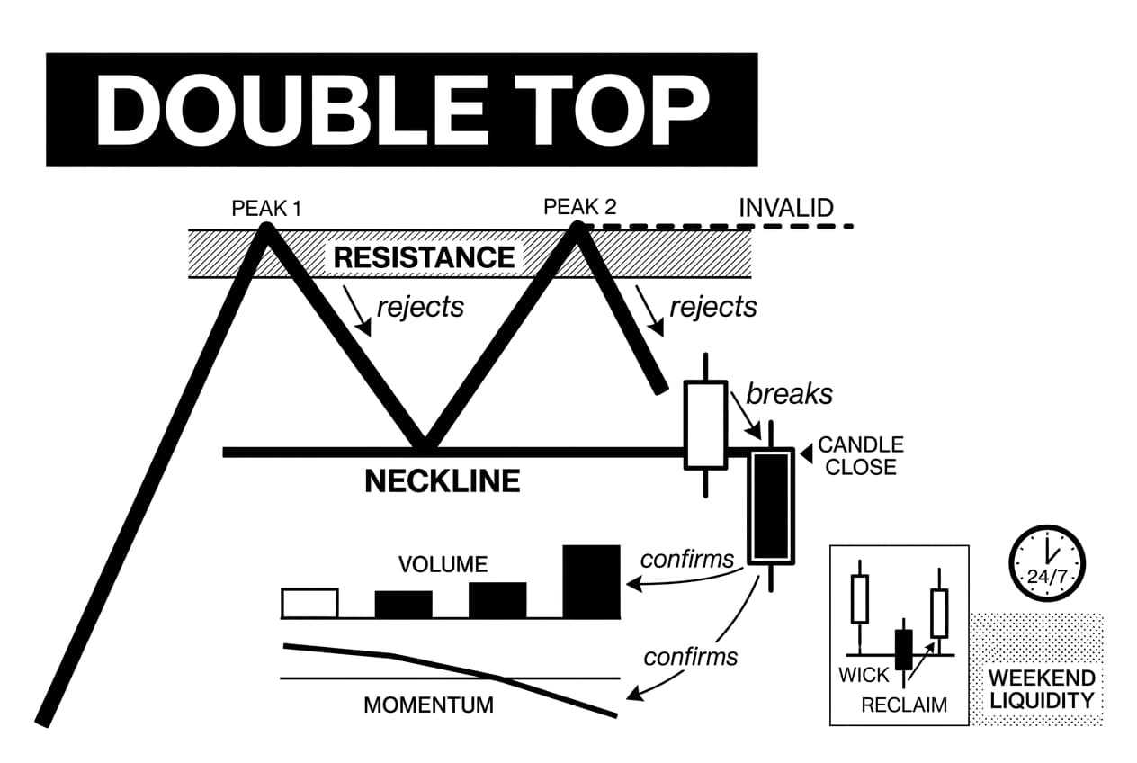
A double top chart pattern is a bearish reversal setup that appears after an uptrend, when price rejects the same resistance area twice. The neckline is the support low between the peaks. Confirmation requires a candle close below that neckline, ideally with volume and momentum support.
Why it matters: crypto traders often see two highs and rush to short, but the shape alone is not enough. A useful double top tells you where buyers may be losing control, where the trade idea is invalid, and whether the possible reward is large enough to justify the risk.
As of March 2026, this guide treats the pattern as a decision framework, not a prediction tool. Crypto trades 24 hours a day and 7 days a week (CME Group, accessed March 2026), so neckline breaks can happen during thin weekend liquidity. That makes confirmation, stop placement, and position size more important than the drawing.
Plain-English analogy: two failed tests of the same ceiling
Think of the resistance area like a ceiling in a low room. Price jumps into it once, falls back, and later jumps into the same area again. If the second jump cannot push through and the floor between the jumps breaks, traders have evidence that the ceiling held and buyers lost strength.
The analogy has a limit. Real markets are not rooms with fixed floors. In crypto, a neckline can be briefly pierced during a low-liquidity hour and then reclaimed fast. A candle close below support carries more weight than a wick below it.
Brief background: why traders watch reversal patterns
Chart patterns come from technical analysis, which studies price and volume data to understand how market participants have behaved. It is not a forecast system. It is a way to organize risk around repeated behavior such as fear, greed, hesitation, and forced selling.
The double top remains popular because it gives traders three visible levels: resistance at the peaks, support at the neckline, and invalidation above the second peak. That structure helps beginners avoid vague trades such as shorting only because price feels high.
Bitcoin offers a useful historical reference. It reached about $69,044 on November 10, 2021, according to CoinGecko historical data, then later failed to maintain that cycle-top area. By November 2022, bitcoin had traded near $15,600 (CoinGecko historical data, November 2022). The lesson is not that every double top leads to the same result. The lesson is that a failed second high can become serious when broader liquidity and momentum also weaken.
For broader context, Lyn Alden, founder at her research firm, often analyzes bitcoin through macro liquidity, debt, and monetary-cycle lenses. Willy Woo, on-chain analyst, focuses on network and holder behavior. Those two perspectives are useful reminders that a chart pattern should be checked against conditions beyond the candles.
How the double top pattern forms
Once you know the basic shape, watch how the setup develops step by step. A valid chart pattern double top forms only after buyers have already driven price upward. Without that prior rise, there is no bearish reversal to confirm.
The five core parts of the pattern
- Prior uptrend: price has been making higher highs and higher lows. This gives the pattern a trend to reverse.
- First peak: price reaches a resistance area, which means a zone where sellers previously overwhelmed buyers.
- Pullback to neckline: price retreats to a support low. The horizontal level drawn through that low is the neckline.
- Second peak: price rallies toward the same resistance area but fails to break and hold above it.
- Neckline breakdown: price closes below the neckline. This is the formal confirmation that the double top may be active.
What the pattern says about buyers and sellers
The first top shows that sellers were strong enough to stop the rally. The pullback shows buyers were still willing to defend a lower support area. The second top is where the message changes. If price returns to resistance but volume and momentum weaken, demand may be fading.
The neckline break matters because it shows that buyers no longer defended the support level between the two peaks. This is why the shape alone is not the signal. The behavioral shift is the signal: sellers defended resistance twice, then buyers lost the intermediate support.
A conservative trader waits for the market to prove that shift. A more aggressive trader may prepare before the break, but should still define the invalidation level in advance. In both cases, the trade plan starts before the order is placed.
How to identify a valid double top in crypto
In crypto, a double top chart pattern must be separated from ordinary chop. The market can print two similar highs on a short timeframe and still continue higher. Validity improves when the setup has trend context, enough time between peaks, and clear confirmation.
Double top identification checklist
- Prior uptrend: price should have risen clearly before the first peak. A sideways market with two highs is not enough.
- Two peaks near the same resistance: the highs do not need to match exactly. In liquid large-cap crypto, a difference of about 1% to 3% is often treated as close enough, but context matters.
- Visible trough between peaks: the pullback should create a real neckline. A tiny dip between two candles is usually too weak to trade.
- Lower momentum on the second peak: momentum means the speed and strength of price movement. If price retests resistance while momentum fades, buyers may be tired.
- Confirmed close below the neckline: the setup is not complete until price closes below support. A wick below support is only a warning.
Bitcoin again gives a practical reference. The late-2021 top near $69,044 on November 10, 2021, according to CoinGecko, followed months of strong upside. Traders who waited for support breaks and weaker momentum had more evidence than traders who shorted only because price returned to a prior high.
When checking Ethereum resistance levels, apply the same checklist. You are not looking for two perfect dots on a chart. You are looking for repeated rejection at a known area, followed by a break of the support that buyers were expected to defend.
Timeframes: why longer charts often matter more
A one-minute double top can form and fail before a beginner has finished placing an order. Four-hour, daily, and weekly charts often provide cleaner structure because they filter some of the noise created by constant crypto trading.
Shorter charts still have a role. A trader can identify the broader pattern on a daily chart, then use a shorter chart to time an entry after the neckline breaks or retests. The higher timeframe gives the context. The lower timeframe helps with execution.
A setup that forms over six weeks usually carries more information than one that forms in two hours. More market participants saw the same resistance, more orders interacted with the level, and the later breakdown or failure is more meaningful.
Longer timeframes are not automatically safe. Weekend liquidity, exchange-specific wicks, and sudden news can still create false breaks. Treat timeframe as one input, not a guarantee.
Confirmation signals: volume, RSI, MACD, and trendlines
Shape alone does not make a trade. Confirmation asks whether other evidence supports the bearish story. The most useful tools are volume, momentum indicators, and trendlines. Each answers a different question.
Volume: did sellers actually show up?
Volume means the amount of an asset traded during a period. A neckline break on rising volume is more convincing because it suggests real participation, not just a thin move through support. A break on low volume deserves caution, especially during late-night or weekend sessions.
For context beyond exchange volume, Willy Woo, on-chain analyst, publishes bitcoin network and holder data that many traders use to compare price action with underlying market behavior. That does not replace a trading plan, but it can help filter noisy breakdowns.
Pairing volume analysis with trendline trading adds another layer of evidence. If price breaks the neckline and a rising trendline at the same time, the bearish case is stronger than a neckline break alone.
Momentum divergence: when price looks strong but strength fades
The relative strength index, or RSI, measures recent price momentum on a scale from 0 to 100. Readings above 70 often show overbought conditions, while readings below 30 often show oversold conditions. MACD, short for moving average convergence divergence, compares moving averages to show whether momentum is building or fading.
Bearish divergence appears when price reaches a second peak near the first peak, but RSI or MACD makes a lower high. The message is simple: price looks similar, but the push behind it is weaker.
Do not use one indicator as a yes-or-no switch. RSI above 50 does not automatically invalidate the setup. What matters is whether the second peak shows weaker momentum than the first and whether the neckline break confirms that weakness.
- Volume expansion on the break supports the bearish signal.
- Low-volume breakdowns are more likely to reverse back above the neckline.
- Bearish RSI divergence means price retests resistance while momentum makes a lower high.
- MACD weakness supports the same idea when the histogram or signal lines roll over.
- Trendline breaks add context when they happen near the neckline.
How to trade a double top chart pattern step by step
Trading the pattern means turning the observation into a plan. The following example uses round numbers only to show the math. Suppose bitcoin rallies to $72,000, pulls back to a neckline at $68,000, retests $72,000, fails, and then closes below $68,000.
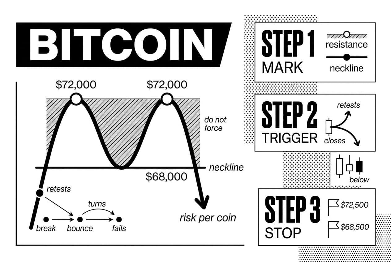
Step 1: mark the structure
Draw the resistance zone across the two peaks. Then draw the neckline across the trough between them. If the peaks are far apart in price or the trough is barely visible, do not force the pattern.
Step 2: choose the entry trigger
There are two common entries. The first is a candle close below the neckline. In the example, that means a confirmed close below $68,000. The second is a retest entry, where price breaks below the neckline, bounces back toward it from underneath, fails to reclaim it, and then turns lower.
A retest entry often gives a tighter stop, but it does not always appear. Fibonacci retracement levels can help identify where a retest bounce may stall, but they should support the plan rather than replace confirmation.
Step 3: place the stop where the idea is wrong
A stop-loss is an exit order that closes a trade if price moves against you. For a double top, the invalidation area is usually above the second peak. In the example, that could mean a stop around $72,500 for an aggressive entry.
If using a retest entry near $68,000, a trader might place the stop just above the failed retest, such as $68,500. The closer stop reduces risk per coin, but it can also be hit more easily. Crypto volatility makes a realistic buffer important.
Step 4: calculate the target and risk-reward
The classic measured move subtracts the neckline from the peak. In this example, $72,000 minus $68,000 equals $4,000. Project that distance below the neckline: $68,000 minus $4,000 equals $64,000. That target is a planning tool, not a promise.
Now compare reward with risk. If entry is near $68,000, stop is near $68,500, and the target is $64,000, the risk is about $500 while the possible reward is about $4,000. That is an 8:1 reward-to-risk ratio before fees and slippage.
The NIVAR check before entry:
N = neckline close, not just a wick.
I = invalidation level defined before entry.
V = volume or momentum confirms the break.
A = account risk capped at about 1% to 2% per trade.
R = reward-to-risk is at least 2:1 after fees.
If any NIVAR item fails, wait. A chart pattern double top is useful only when the trade math supports it.
False breakouts and risk management
Even a clean double top chart pattern can fail. In crypto, false breaks are common because liquidity is fragmented across exchanges, trading never closes, and news can hit while many traders are away from their screens.
Why double tops fail
A pattern can fail because there was no real prior uptrend, the neckline break happened on weak volume, or the second peak actually showed stronger demand. It can also fail because market-wide conditions changed. A favorable regulatory headline, exchange listing, ETF flow, or macro event can push price back above the neckline quickly.
False breaks often hurt traders who enter before a candle close. A wick below support can trigger short entries and stop-loss orders, then price can reclaim the neckline. Once trapped shorts cover, the rebound can accelerate.
Macro context matters here. Lyn Alden, founder at her research firm, publishes research on liquidity and monetary conditions that can help traders understand why some bearish patterns underperform during strong risk-on periods.
Risk-reward before prediction
The most common beginner error is asking whether the pattern will work before asking whether the trade is worth taking. A setup can be directionally right and still be a poor trade if the stop is too wide, the target is too close, or fees and slippage eat the edge.
Use position sizing to control damage. Position sizing means choosing trade size so a loss stays within your plan. Many risk-managed traders cap a single trade at about 1% to 2% of account equity. This keeps one failed pattern from becoming a portfolio-level problem.
- No prior uptrend? Skip the setup.
- No volume or momentum support? Treat the break as unproven.
- Stop is too wide? Reduce position size or pass.
- Reward-to-risk below 2:1? The trade math is weak.
- Major news pending? Technical levels can break fast.
Double top vs double bottom: key differences
A double top warns that an uptrend may be ending. A double bottom chart pattern does the opposite. It appears after a downtrend and suggests sellers may be losing control.
Quick comparison table
Pattern | Market Bias | Appears After | Confirmation Trigger | Typical Stop Area |
|---|---|---|---|---|
double top | bearish | uptrend | close below the neckline | above the second peak |
double bottom | bullish | downtrend | close above the neckline | below the second trough |
The logic is mirrored. A double top shows buyers failing twice at resistance. A double bottom shows sellers failing twice at support. In both cases, confirmation requires price to break the level that separates the two tests.
The practical difference is what you do with the information. A double top chart pattern may tell a long trader to protect gains or a short trader to prepare a bearish setup. A double bottom may tell a trader to watch for a bullish reversal. Neither pattern has meaning without the prior trend.
Pros, cons, and common beginner mistakes
The double top chart pattern is useful because it gives structure. It is limited because markets do not have to respect that structure. Use it as a planning tool, not as proof that price must fall.
Pros
- Clear levels: the peaks, neckline, stop area, and target are visible.
- Risk can be planned: invalidation above the second peak helps with sizing.
- Easy to explain: the pattern shows two failed attempts to break resistance.
- Works across assets: the same logic can apply to bitcoin, ether, and liquid altcoins.
Cons
- Late confirmation: by the time the neckline breaks, part of the move has already happened.
- False signals: crypto often wicks below support and reverses.
- Subjective structure: two traders may disagree about whether the peaks are close enough.
- Noise on short timeframes: five-minute charts can show many weak patterns that fail quickly.
For broader context on sentiment-driven tools at cycle extremes, the bitcoin rainbow chart guide is worth reading alongside pattern analysis. It shows why visual tools can help with context but should not replace a risk plan.
Mistakes to avoid
- Shorting before confirmation: touching the old high is not enough. Wait for the neckline to break.
- Ignoring volume: a weak-volume break is not the same as a broad selloff.
- Forcing the setup: if you need to squint to see the pattern, skip it.
- Using too much size: even a strong setup can fail. Keep account risk small.
- Forgetting the market regime: bullish liquidity conditions can overpower bearish chart setups.
The better framing is this: the double top is a probable reversal setup only after confirmation. Its value comes from giving traders a repeatable way to define entry, invalidation, target, and size.
Key takeaways
- A double top chart pattern signals a potential bearish reversal after an uptrend, but it is not confirmed until price closes below the neckline.
- Confirmation improves when volume expands, momentum weakens on the second peak, and the neckline break holds.
- Crypto’s constant trading makes false breaks more likely, so candle closes matter more than brief wicks.
- The NIVAR framework keeps the focus on neckline confirmation, invalidation, volume, account risk, and reward-to-risk.
- Risk management is the edge. Decide stop-loss, position size, and target before entering.
Frequently Asked Questions
- Is double top pattern bullish?
- No, the double top is generally considered a bearish reversal pattern. It signals that price failed twice to break above the same resistance level. That said, the pattern isn't confirmed until price closes below the neckline. If that breakdown never happens, a failed double top can actually become a bullish continuation signal.
- How to use double top pattern in trading?
- Start by identifying an established uptrend, then mark two comparable peaks and draw the neckline at the trough between them. Wait for a confirmed close below the neckline before entering. Place your stop-loss above the second peak, and calculate your price target using the pattern's height measured from neckline to peaks. Never skip risk management.
- What comes after a double top pattern?
- After a confirmed breakdown, traders typically expect a move lower toward the measured target. In practice, price sometimes retests the neckline from below before continuing down, consolidates sideways, or invalidates the pattern entirely by pushing back above resistance. This last scenario is especially common in volatile markets like cryptocurrency.
- Is the double top pattern accurate?
- It can be a useful tool, but it is far from perfect. Accuracy depends heavily on the timeframe used, overall trend quality, volume behavior, and broader market conditions. Treat it as a probability-based setup rather than a guaranteed outcome, and always pair it with solid risk management to stay protected when it fails.
- What is the pattern of a double top candlestick?
- The double top is a multi-candle chart pattern, not a single candlestick formation. It develops over time when price rallies to a resistance level, pulls back to form a trough, rallies again to roughly the same high, and then potentially breaks below the neckline. It takes many candles to form properly.
- What is the success rate of the double top pattern?
- There is no single reliable number that applies universally. Success rates shift depending on the asset, timeframe, confirmation rules, and current market regime. Rather than chasing a win rate statistic, backtest your specific setup rules and evaluate overall expectancy — how much you make on winners versus how much you lose on losers.
- Is double top better on longer timeframes?
- Generally, yes. Longer timeframes filter out short-term noise and tend to reflect broader market participation, which can produce more meaningful signals. The trade-off is that stops become wider and setups appear less frequently. Traders using daily or weekly charts should adjust position sizing carefully to keep risk consistent across different timeframe setups.
Sources
Author

Crypto analyst and blockchain educator with over 8 years of experience in the digital asset space. Former fintech consultant at a major Wall Street firm turned full-time crypto journalist. Specializes in DeFi, tokenomics, and blockchain technology. His writing breaks down complex cryptocurrency concepts into actionable insights for both beginners and seasoned investors.


