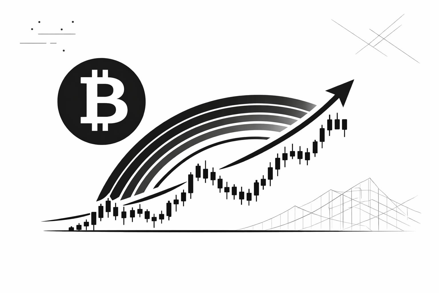
Bitcoin Rainbow Chart 2026: A Guide to the Famous Indicator
What is the Bitcoin Rainbow Chart? (A Simple Explanation)
The bitcoin rainbow chart is a long-term price model that overlays colored bands on a logarithmic growth curve to show potential market sentiment. Think of it less like a precise scientific instrument and more like a colorful weather map for Bitcoin's historical price cycles, showing the general "climate" of the market over many years.

Why does this simple chart capture so much attention? Because it provides a powerful, at-a-glance perspective on where Bitcoin's price is in its broader historical cycle. The chart is made up of nine distinct color bands, each representing a different phase of market sentiment. When the price enters the upper red bands, it has historically signaled a "bubble" phase, a time of maximum exuberance. Conversely, when the price dips into the lower blue and green bands, it has historically suggested a "fire sale," where Bitcoin might be undervalued.
It's vital to remember that this chart is a fun and simplified model based on past performance, not a crystal ball for market timing. The bands themselves are not based on any scientific formula but are simply fitted to the historical price action. As such, the bitcoin rainbow chart is best used as a tool for managing emotions and gaining perspective during volatile market swings, rather than as a predictive tool for making financial decisions.
The History and Origin of the Bitcoin Rainbow Chart
The Bitcoin Rainbow Chart wasn't designed in a sophisticated trading firm or by a team of financial analysts. Its story begins much more humbly, back in 2014, on the popular BitcoinTalk online forum. A user first posted a chart that applied a logarithmic regression curve to Bitcoin's historical price action. This original model was a purely mathematical attempt to visualize the cryptocurrency's long-term growth channel. It was insightful, but it wasn't yet a rainbow.
The transition from a simple curve to the vibrant spectrum we know today was a community effort. Other enthusiasts took the original concept and added the colorful bands, each representing a different market sentiment zone. This evolution from a statistical model to an intuitive, color-coded visual is what gives the chart its unique character. It grew organically, blending serious data analysis with a dose of internet meme culture, which is why it holds such a special place in the crypto community.
How to Read the Bitcoin Rainbow Chart: Decoding the Color Bands
Think of the Bitcoin Rainbow Chart as a weather map for market sentiment. Instead of showing rain or sun, it displays the emotional "temperature" of the Bitcoin market, giving you a quick visual guide to whether the market is historically cool and undervalued or hot and overbought. It does this by plotting Bitcoin's price against a logarithmic growth curve, which is just a way of showing price movement over a very long time in a more manageable view.
The magic of the chart lies in its simplicity. The price of Bitcoin moves up and down through the colored bands of the rainbow over time. Each color zone represents a different phase of the market cycle, based entirely on historical data. Here’s a simple breakdown of what each band suggests:
- Dark Red: Maximum Bubble Territory. Historically, this is the peak of market euphoria.
- Red: Sell Zone. The market is considered extremely overvalued.
- Orange: FOMO Intensifies. The "Fear Of Missing Out" is strong and the market is getting heated.
- Yellow: HODL Phase. The price is in a neutral or "fair value" zone.
- Light Green: Accumulation. The price is still considered cheap.
- Green: Buy Zone. Historically, a great time for long-term accumulation.
- Blue: Fire Sale. The market is deeply undervalued according to the model.
Cool Colors (Blue, Green): The 'Buy' Zone
When Bitcoin's price dips into the lower, cooler bands—like blue and green—the chart signals a period of market depression. These have historically been times of negative sentiment, where many have lost interest after a market peak. For long-term believers in Bitcoin, these "crypto winters" have often been viewed as prime accumulation periods, or what the chart labels a "Fire Sale." Buying in these zones has historically been a successful long-term strategy, though it often requires going against prevailing market fear.
Neutral Colors (Yellow, Orange): The 'HODL' Zone
As the price moves into the middle bands of yellow and light orange, it suggests the market is reaching a more balanced valuation. This is the heart of the "HODL" territory. The term, a popular crypto meme meaning "Hold On for Dear Life," perfectly captures the sentiment here. The price is no longer at a deep discount, but it isn't yet in the overheated territory of a bull market peak. During this phase, many investors simply hold their positions, waiting for the next major market move.
Hot Colors (Red, Dark Red): The 'Sell' or 'FOMO' Zone
The upper, hotter bands of the rainbow are where the excitement reaches a fever pitch. As the price enters the orange, red, and dark red zones, it historically indicates that market euphoria and FOMO are taking over. These periods often coincide with market cycle tops, where prices become detached from their underlying value. While the chart humorously labels these zones as "Sell. Seriously, SELL!" and "Maximum Bubble Territory," it’s important to remember this is a reflection of past cycles. It serves as a powerful reminder of market psychology and the potential for a sharp correction when sentiment is at its most extreme.
The Math Behind the Rainbow: Logarithmic Regression Explained
While the vibrant colors give the chart its playful name, the core structure is built on a serious mathematical concept: logarithmic regression. Think of it as a way to draw a curved line of "best fit" through data points that are growing rapidly but at a slowing rate over time. This pattern happens to fit Bitcoin's long-term price history remarkably well, from its early days of explosive growth to its more mature, yet still volatile, market cycles we see today.
Imagine plotting the growth of a giant redwood tree. In its first few years, it might double in height, a massive percentage gain. As it gets older, growing another few feet is a much smaller percentage of its total height. A standard chart would make the early growth look like a vertical line and later growth appear almost flat. A logarithmic scale, however, adjusts for this. It focuses on percentage change, so a doubling in price from $1 to $2 looks just as significant as a doubling from $30,000 to $60,000. This scale helps visualize the long-term trend without getting distracted by the sheer size of the numbers.
The bitcoin rainbow chart takes this principle and applies it to price history. It calculates a logarithmic regression curve that represents the general long-term growth path. The colorful bands are then simply drawn above and below this central curve. This mathematical foundation is what allows the chart to neatly contain Bitcoin's wild price swings within its rainbow, providing a cleaner perspective on historical market cycles.
The Rainbow Chart and Bitcoin Halvings
One of the most compelling patterns visualized by the Bitcoin Rainbow Chart relates directly to the network's built-in scarcity mechanism: the halving. Approximately every four years, the reward for mining new Bitcoin is cut in half. This event drastically reduces the rate at which new coins are created, acting as a predictable supply shock.

When you map these halving dates onto the chart, a clear historical rhythm appears. The periods following a halving have often ignited Bitcoin's most dramatic bull runs. The price has tended to awaken from the lower blue and green bands and begin a steady climb toward the warmer colors. This ascent into the orange and red zones, signaling a heated market, has historically peaked 12 to 18 months post-halving.
Looking back from 2026, the halving of 2024 perfectly illustrates this tendency. The subsequent price appreciation throughout 2025 followed the script of previous cycles, pushing the price into the upper bands of the rainbow. While this four-year cycle is a powerful force, it’s not the only factor at play; things like mainstream adoption and even Bitcoin seasonality contribute to market movements. The chart helps us see the powerful, recurring echo of the halving across Bitcoin's history.
The Limitations and Criticisms of the Rainbow Chart
While the chart offers a beautiful, long-term perspective on Bitcoin's price history, it's essential to approach it with a healthy dose of skepticism. The most significant limitation of the bitcoin rainbow chart is that it is a backward-looking model. It is designed to fit past price data, not to predict future movements with any certainty. Think of it as a beautifully drawn map of a road someone has already traveled—it shows the path taken but doesn't reveal what lies around the next bend.
Critics often point out that the model is a form of curve-fitting. The colorful bands have been adjusted over time to perfectly contain Bitcoin's historical price action. This creates a neat and tidy picture, but it doesn't mean future prices will respect these same boundaries. The market is dynamic, and what worked for the last decade may not apply to the next.
The chart is a purely mathematical creation that ignores the real world. It cannot account for sudden, market-shaking developments. Major exchange collapses, unexpected regulatory crackdowns, or technological breakthroughs are all black swan events that can instantly invalidate any historical model. Relying solely on the rainbow chart means ignoring all the external factors that truly drive market behavior. Ultimately, past performance is never a guarantee of future results.
How to Use the Bitcoin Rainbow Chart in Your Strategy (2026)
So, how can you actually apply this colorful tool to your approach? First, it’s vital to understand that the bitcoin rainbow chart is not a short-term signal generator like many other trading indicators. Instead, think of it as a historical mood ring for the market. Its real strength lies in providing a macro perspective, helping you gauge whether the current market sentiment is leaning towards irrational exuberance (the upper red bands) or despair (the lower blue bands). This context can be a powerful antidote to emotional decision-making.
For long-term investors, the chart serves as a simple visual check-in. When prices are skyrocketing and everyone is euphoric, a glance at the "Maximum Bubble Territory" band can be a sobering reminder to be cautious. Conversely, when prices are low and fear dominates the news, seeing the price in the "Basically a Fire Sale" zone can offer the historical perspective needed to stay the course. It's a tool for managing your own psychology, not for predicting exact tops and bottoms.
Key Takeaways

- The bitcoin rainbow chart is a long-term visualization tool based on past data, not a predictive financial instrument.
- Cooler colors like blue and green have historically signaled potential buying zones, while warmer colors like red suggest an overextended market.
- Its primary use is to contextualize Bitcoin's price within historical cycles, helping to remove emotion from long-term investment decisions.
- The chart is a retrospective model and its color bands can break; it should never be used for precise market timing.
Author

Crypto analyst and blockchain educator with over 8 years of experience in the digital asset space. Former fintech consultant at a major Wall Street firm turned full-time crypto journalist. Specializes in DeFi, tokenomics, and blockchain technology. His writing breaks down complex cryptocurrency concepts into actionable insights for both beginners and seasoned investors.


